Klaviyo email design for Shopify and WooCommerce brands
I design on-brand emails in Figma, get your approval, then set them up in Klaviyo so they look right on every phone and inbox. A beautiful email isn't automatically a good one, so every design I create combines strategy, copy, UX, and brand, not just graphics.
★★★★★ 5.0 on Fiverr and Upwork · 190+ projects delivered · Klaviyo Product certified
Brands I've designed emails for
Always Friday
Aventa
Love Coco
G_CERO
Pestle & Pods
Afritude
MantaSocks
Flushhh
Filigree
KUGELLAGER24
+ more under NDA
My approach
A beautiful email isn't automatically a good one.
I've seen emails that look amazing in Figma but still underperform: a weak call to action, no clear hierarchy, an unclear offer, a poor mobile layout, or simply too much going on. That's why I don't treat email design as graphic design alone. Every email I create has to look like your brand and help someone decide to buy.
These aren't three competing services. They're three ways I produce an email, and I pick the one that fits the design and how often you'll edit it.
01
Native Klaviyo design
I design directly in Klaviyo's drag-and-drop editor, using sections, columns, product blocks, dynamic content, and reusable universal content.
Best for
Regular campaigns, core flows, newsletters, and emails you'll want to edit later.
Strengths
Fast to produce, easy for your team to edit, and excellent with product feeds, personalization, and coupons.
Limits
Very unusual layouts, typography, or visual treatments can be hard to reproduce exactly.
02 · My standard
Figma + Klaviyo
I design the email in Figma first, you approve it, and I recreate it in Klaviyo. Design and setup are separate, so the creative work gets full attention.
Best for
Premium brands, redesigns, new brand systems, and anyone who wants to approve the design first.
Strengths
Strong design, fewer revisions, and a finished email that's still easy to maintain.
Limits
A small design adjustment is sometimes needed so it works in every inbox.
03
Custom HTML and hybrid
For designs the native editor can't handle, I code the template in email-safe HTML and import it into Klaviyo, or create a hybrid template with editable areas.
Best for
Highly custom brands and layouts the drag-and-drop editor can't reproduce well.
Strengths
Full control over layout and spacing. Hybrid templates keep product blocks and universal content editable.
Limits
Slower to create and test, and harder for your team to edit later.
Native vs Figma-based vs custom HTML
Area
Native Klaviyo
Figma + Klaviyo
Custom HTML
Coding required
No
No, design first
Yes
Design flexibility
Medium–high
Very high
Very high
Easy for your team to edit
Excellent
Excellent when set up natively
Limited
Speed
Fast
Medium
Slower
Dynamic Klaviyo features
Excellent
Excellent
More technical
Approval before setup
Good
Excellent
Good
Best for campaigns and flows
Excellent
Excellent
Good
My workflow
From strategy to the inbox.
This is how I produce every email. I only move to custom HTML when native Klaviyo genuinely can't do the design, because coding every campaign doesn't scale.
StrategyThe goal of the email
CopyHeadline, body, and CTA
Figma designDesktop and mobile
Your approvalBefore any setup
Klaviyo setupRecreated natively
Mobile polishStacking and sizing
PersonalizationDynamic content
QAInboxes, links, dark mode
LaunchCampaign or flow
Inside the Figma process
How I design one email.
Example: a new jacket launch, with one goal of sending customers to the product page.
Step 1Define the objective
What should the reader do after opening? Here, visit the product page.
Your colors, fonts, photography style, buttons, icons, and spacing, so the email feels like your website.
Step 4Design for desktop
Around 600–640px wide, designed for how emails actually render, not like a 1440px landing page.
Step 5Design for mobile
A separate mobile design for text size, button size, stacking, and image cropping. Mobile isn't just desktop made smaller.
Step 6Your approval
You approve copy, images, layout, products, and CTAs before setup, which keeps revisions cheap.
Step 7Set it up
Natively in Klaviyo for standard layouts, or as custom HTML or a hybrid template when the design needs it.
A typical email structure
Header · logo, navigation
Hero · image, headline, CTA
Product · image, name, price
Benefits and USPs
Social proof · reviews
Secondary CTA
One rule I keep
Never one giant image.
What I avoid
Exporting the whole Figma design as one long JPG.
Text that can't be read or selected
Poor accessibility and responsiveness
No dynamic content or personalization
An almost empty email when images are blocked
Hard to edit later
What I do instead
Use Figma as the design reference, then set it up with live elements.
Headlines, body text, and CTAs stay live text
Product names and prices stay editable
Images for heroes, lifestyle shots, and decoration
Alt text on every image
Responsive on every screen
Template system
A modular design system for your brand.
For long-term clients, I create a set of reusable modules instead of designing every email from scratch. Each campaign becomes a combination of modules, which makes production faster and keeps every email consistent.
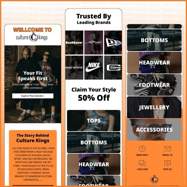
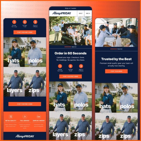
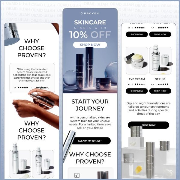
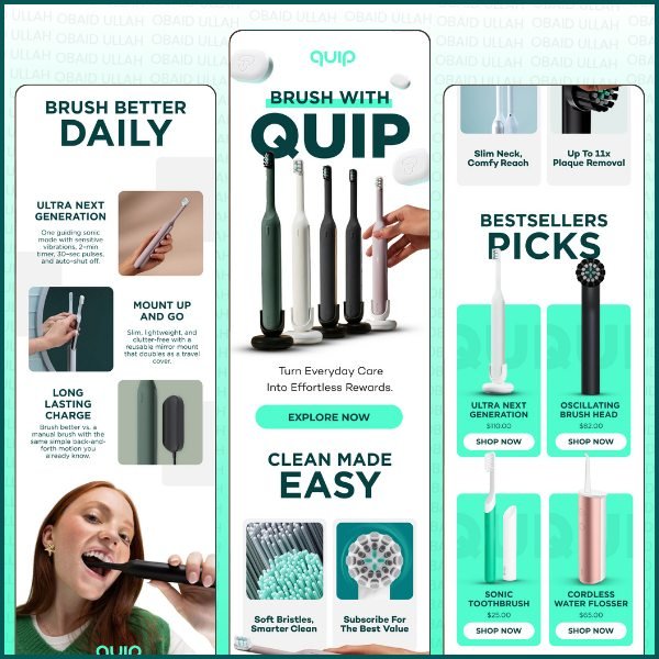
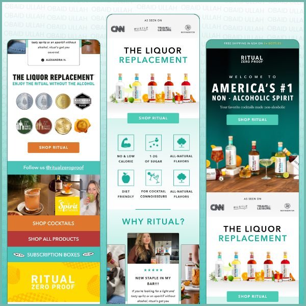
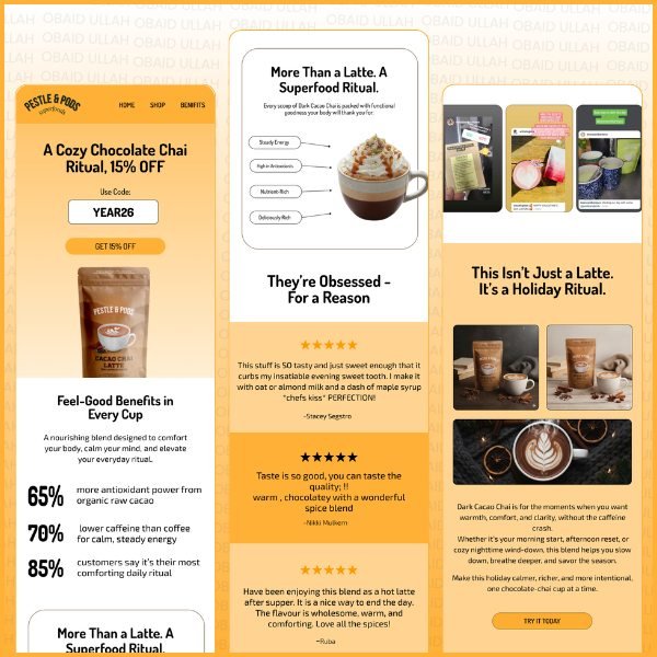
Culture Kings Concept designAlways Friday Client workProven Concept designQuip Concept designRitual Zero Proof Concept designPestle & Pods Client work
★★★★★
Fiverr
"
The biggest issue when getting an email designer is that you need to micro manage everything, they ask 100 questions to do the job. Well thats not the case here. All i did was give my product, content and website, he made the rest. I could write a whole paragraph.
The abandoned checkout flow recovers €2K+ every single month. The design quality is
exceptional. It doesn't look like a Klaviyo template, it looks exactly like our brand.
AK
Alex K.
Co-Founder, MagneCHEF
★★★★★
Fiverr
"
Obaid is truly Amazing 💯 The level of Quality exceeded my expectations. Amazing work 😁 Very professional Quick to respond Quick delivery Will definitely recommend & use him again
Usually both. I design the email in Figma first so you can approve it, then recreate it natively in Klaviyo. For simple, fast-moving campaigns, I sometimes design directly in Klaviyo.
Yes, when they're set up natively in Klaviyo, which is my default. You can change text, images, buttons, links, products, and discounts without touching any code.
Yes. I create a separate mobile design in Figma and check text size, button size, stacking, and image cropping, because most people read ecommerce emails on their phones.
Only when the design genuinely can't be reproduced in Klaviyo's editor, such as highly custom layouts. I can also create hybrid templates that keep product blocks and universal content editable.
A single image loses live text, accessibility, responsiveness, personalization, and easy editing, and it can look empty when images are blocked. I keep headlines, copy, prices, and CTAs as live elements.
Yes. For ongoing clients, I create modular sections, like headers, heroes, product blocks, reviews, and footers, so every new email is faster to produce and stays consistent.
Yes. I check desktop and mobile previews, Gmail, Apple Mail, and Outlook, dark mode, links, coupons, and dynamic content, and I send test emails before every launch.
Yes. Copy and design are planned together, because the headline, hierarchy, and CTA matter as much as the visuals.
Let's talk
Let's design emails that look like your brand.
Send me your website and a recent email, and tell me what you'd like to change. The first conversation is free. You can also browse my email design portfolio first.